HakiKoe Instagram Feed
Overview
Designed a concept-driven packaging for “Yummy Galaxy” that combines bold visual identity with clear structure. Focused on thematic storytelling, strong color contrast, and controlled layout to create a memorable and differentiated product presence.
Category
Digital Product Design
Tools
Affinity
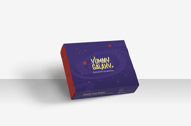
Packaging plays a critical role in shaping first impressions, especially for products competing in visually crowded markets. For Yummy Galaxy, the objective was to create a packaging system that felt less like a conventional snack box and more like an experience-driven product with a strong visual identity.
The concept was built around a galaxy-inspired narrative, using cosmic textures, orbit lines, and layered graphic elements to create a sense of exploration and movement. A deep purple base established visual depth, while red accents introduced contrast and energy to improve shelf visibility and brand differentiation. Typography became a central element within the system, using bold and rounded forms to reinforce a playful yet structured tone.
To maintain clarity, the information hierarchy was intentionally kept minimal. Product details were positioned strategically to preserve clean visual space without reducing readability. This allowed the packaging concept to remain visually dominant while still functioning effectively as a consumer product. The overall structure also reflects common packaging principles referenced by organizations such as the Packaging of the World, where strong differentiation, hierarchy, and memorability contribute heavily to product recognition.
The result is a packaging design that balances storytelling and functionality — creating a distinctive visual presence while reinforcing Yummy Galaxy’s positioning as a curated and enjoyable snack experience.